
Most rooms fail for the same reason: decisions get made in isolation.
A sofa gets chosen because it looks good in the store. Paint colour gets picked off a swatch. Furniture gets arranged around the TV. The result is a room full of individually fine choices that collectively produce nothing.
These 7 basics of interior design are the framework that stops that from happening.
Why Interior Design Has Rules
Design principles exist because the human eye and brain respond to visual environments in predictable ways. A 2021 report from the American Society of Interior Designers (ASID) found that 68% of respondents said their home environment directly affects their mental well-being. That is not a soft finding. It means the structure of a room has measurable consequences.
Professionals apply these fundamentals not as rigid constraints, but as a diagnostic tool. When a room feels off but you cannot identify why, one of these seven principles is the answer.
1. Space: The Foundation Everything Else Sits On
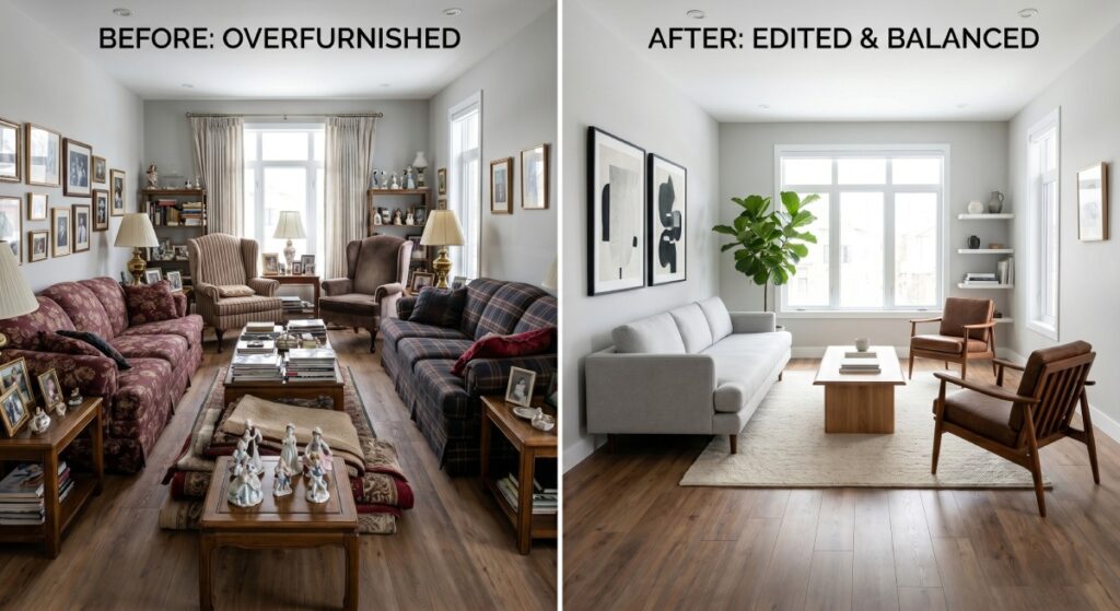
Space is not empty. In interior design, space is an active material.
Positive space refers to the area occupied by objects: furniture, art, plants, and fixtures. Negative space is the open, unoccupied area around them. The relationship between the two determines whether a room breathes or suffocates.
Most homeowners overfurnish because they misread negative space as wasted space. It is not. A room with too little negative space reads as chaotic, regardless of how good the individual pieces are.
The rule to apply:
Walk into your room and remove one piece of furniture mentally. If the room feels better, it stays out.
2. Line: The Direction Your Eye Travels
Every element in a room creates a visual line. Lines direct attention and create psychological responses.
| Line Type | Direction | Psychological Effect | Common Application |
| Horizontal | Across | Calm, stability, restful | Low furniture, skirting boards, shelving |
| Vertical | Up | Height, formality, strength | Tall curtains, floor-to-ceiling joinery |
| Diagonal | Angular | Energy, movement, tension | Staircases, angled furniture arrangements |
| Curved | Organic | Softness, comfort, flow | Rounded sofas, arched doorways, rugs |
A room dominated by a single line type becomes monotonous. A room with competing line types becomes chaotic. The skill is in weighting: choose a dominant line, then let the others play supporting roles.
Real-world example:
A home office with vertical shelving, a horizontal desk surface, and one curved task chair. The verticals signal focus and authority. The horizontal grounds the workspace. The curved chair prevents rigidity. That is deliberate line composition.
3. Form: The Three-Dimensional Shape of Objects
Form is what happens when a line closes on itself and becomes three-dimensional.
Forms are either geometric (cubes, cylinders, rectangles: man-made, structured) or natural (irregular, organic: plants, driftwood, stone). A room composed entirely of geometric forms feels clinical. A room composed entirely of natural forms can feel unresolved.
The practical application: every room needs both. A sharp-edged marble dining table works because a linen chair with organic grain, or a rounded pendant light above it, pulls it back from sterility.
Check your room for form variety before you buy anything new. If everything is boxy and angular, the next purchase should have a curve or an organic form built in.
4. Light: The Variable That Overrides Everything Else
Get the light wrong, and the other six principles cannot save the room.
Light has two categories. Natural light changes throughout the day and is governed by window orientation.
In Australia, north-facing rooms receive consistent natural light year-round. South-facing rooms get cool, diffused light. This should determine your colour palette before you open a paint chart.
In north-facing Australian rooms, controlling the volume and direction of incoming light often comes down to the window treatment chosen, and plantation shutters offer a level of light adjustment that standard blinds cannot replicate.
Artificial light requires three layers to function correctly:
- Ambient: The base level of light for general use (overhead fixtures, recessed lighting)
- Task: Directed light for specific functions (reading lamps, under-cabinet kitchen lighting)
- Accent: Decorative light that creates depth and highlights features (picture lights, strip lighting behind joinery)
A room with only ambient lighting, which describes most Australian homes, is a flat room. It has no shadow, no depth, and no atmosphere, regardless of how well everything else is executed.

5. Colour: The Most Emotionally Loaded Decision You Will Make
Colour does three things simultaneously: it sets emotional tone, alters perceived spatial dimensions, and creates visual relationships between every object in the room.
The 60-30-10 rule is the professional standard for colour distribution:
- 60% dominant colour (walls, large upholstery)
- 30% secondary colour (curtains, secondary furniture, rugs)
- 10% accent colour (cushions, art, accessories)
This ratio works because it mirrors the way the eye naturally wants to rest, then travel, then be surprised.
Colour temperature is where most people get caught out. Warm colours (reds, oranges, yellows) advance visually, making walls feel closer. Cool colours (blues, greens, greys) recede, making spaces feel larger. This is not a stylistic preference. It is how human visual processing works.
Practical test:
If your room feels smaller than its measurements suggest, check the colour temperature on every surface, including the floor and ceiling.
6. Texture: The Dimension That Photography Cannot Capture
Texture is the element most consistently underused by homeowners and most consistently leveraged by professionals.
Texture operates on two levels: tactile (how a surface actually feels) and visual (how a surface appears to feel from a distance). Both matter because both affect how a room reads.
A monochromatic room without textural variety is flat. The same colour palette deployed across matte walls, a velvet sofa, a linen throw, a concrete side table, and a jute rug produces a room with genuine depth and warmth. The colour is consistent. The surfaces tell different stories.
The test:
Photograph your room in black and white. Remove colour from the equation. If the room looks interesting in greyscale, the texture is working. If it looks flat, it is not.

7. Pattern: The Element That Can Unify or Destroy a Room
Pattern is concentrated colour and line. It amplifies everything it touches, which makes it the most powerful and most dangerous of the seven basics.
Three rules govern pattern use:
Scale variation
Never use patterns of the same scale together. Pair a large-scale pattern (bold geometric rug) with a medium-scale pattern (subtle cushion print) and a small-scale pattern (thin stripe on curtain). Same scale patterns fight each other.
Colour connection
Patterns in the same room must share at least one colour. This is the thread that prevents a room from reading as random.
The 1-in-3 rule
In any grouping of three decorative objects, one can carry a pattern. The principles of line, form, and texture are applied very differently across major European traditions, and the contrast between Italian and French interior design shows exactly how the same fundamentals can produce opposing visual outcomes. The other two stay solid. More than one in three, and the eye has nowhere to rest.
How the 7 Basics Work as a System
No principle operates independently. Space affects how form reads. Light changes colour perception. Texture and pattern compete for the same visual attention.
When a professional evaluates a room, they do not run through a checklist. They look at the room as a whole and identify which principle is failing and how that failure is cascading into others.
A room that feels dark and heavy is usually a light problem compounded by a colour temperature problem, not a furniture problem. Replacing the sofa does not fix it. Re-evaluating the window treatment and paint sheen does.
That diagnostic thinking is the actual value of understanding these fundamentals.
Key Takeaways:
- Space, line, form, light, colour, texture, and pattern are not decorating preferences. They are structural principles that determine whether a room functions visually.
- Most room problems trace back to one or two failing principles, not the entire design. Diagnose before you spend.
- Light is the variable that overrides all others. Address it first.
Discussion question: If you had to identify which of the seven basics is most consistently misunderstood by homeowners making purchasing decisions, which would it be and why?